
WEB DESIGN STYLE GUIDES
WEB DESIGN STYLE GUIDE VS. BRAND STYLE GUIDE
CREATING YOUR OWN WEB DESIGN STYLE GUIDE
After studying the design brief, copy template and main copy (if the case), doing research on competitor websites and studying the likes and dislikes the client has sent over, you can start working on creating your own Website Design Style Guide while taking into account the clients:
- Brand
- Typography - examples selected
- Color Palette
- Copy / Voice of Copy
- Iconography
- Imagery
- Buttons
- Spacing
- Forms
Establishing these key points from the start will ease your work load when starting the design on your homepage and rest of the pages.
STUDY THE BRAND - MAKE USE OF BRAND STYLE GUIDES, IF PROVIDED

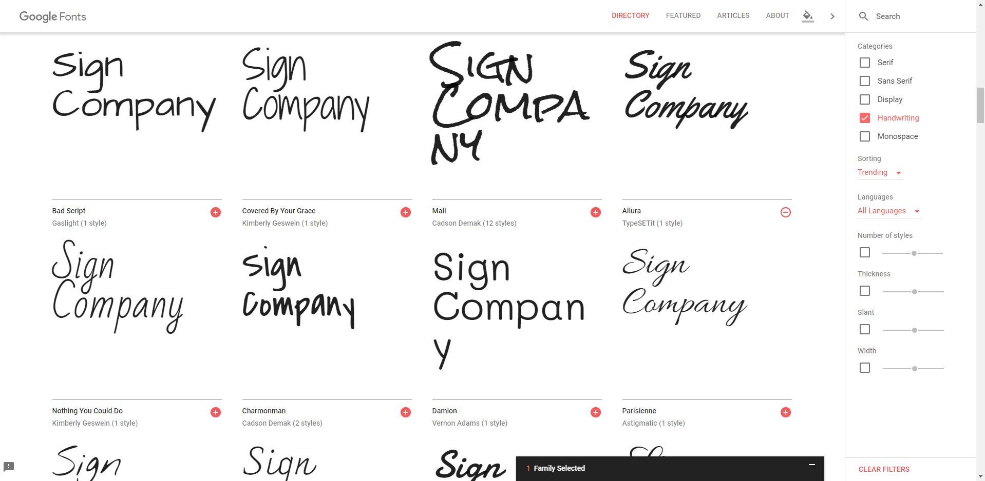
Font selection based on logo
DEFINE THE TYPOGRAPHY
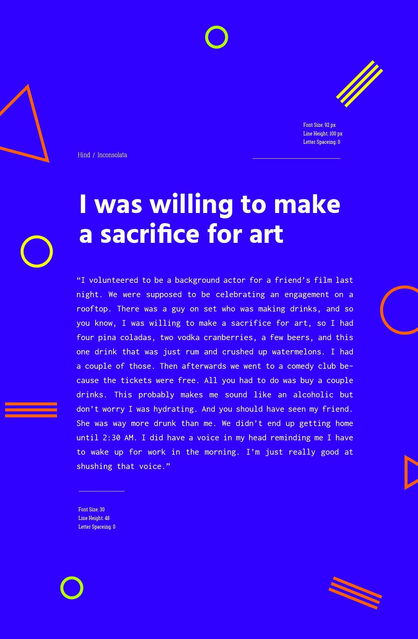
Hind / Inconsolata
Font Size: 92 / 30
Line Height: 100 / 48
Letter Spaceing: 0 / 0

Fjalla / Nunito
Font Size: 190 / 24
Line Height: 172 / 48
Letter Spaceing: 0 / 1700
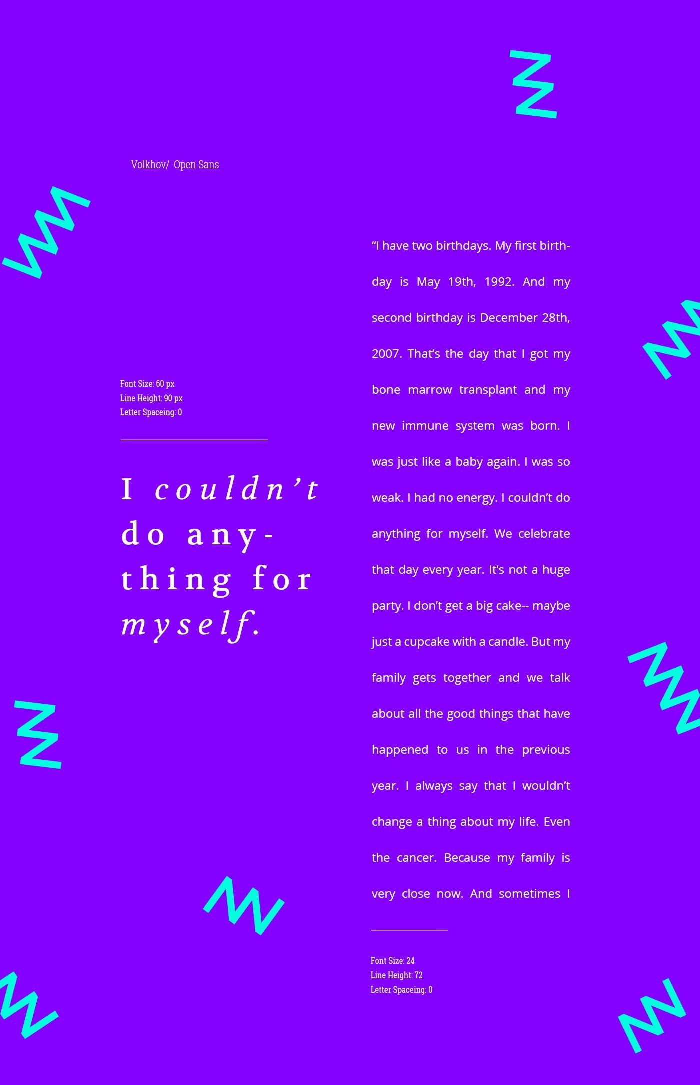
Volkhon / Open Sans
Font Size: 60 / 24
Line Height: 90 / 72
Letter Spacing: 0 / 0
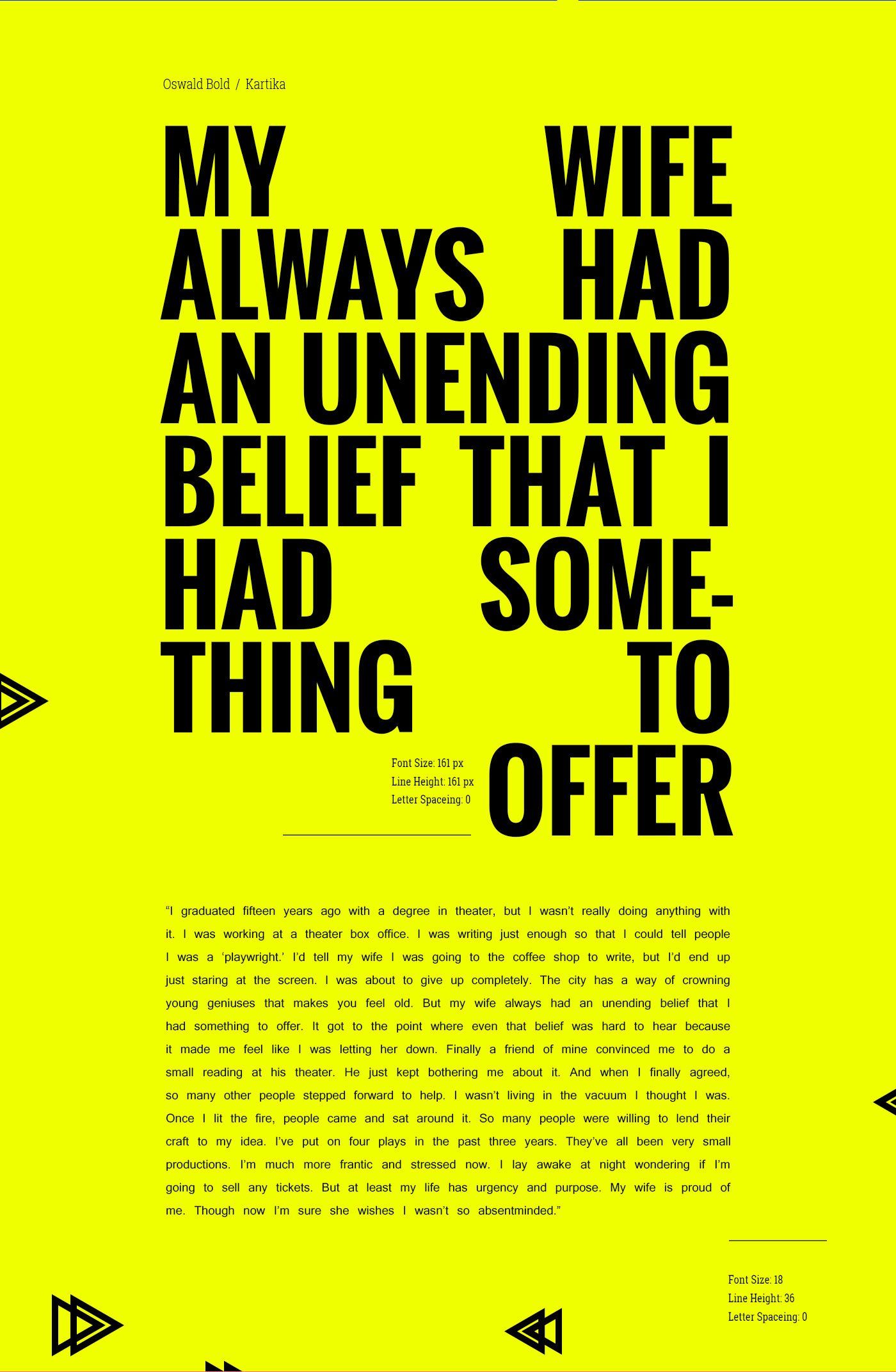
Oswald Bold / Katrika
Font Size: 161 / 18
Line Height: 161 / 36
Letter Spacing: 0 / 0

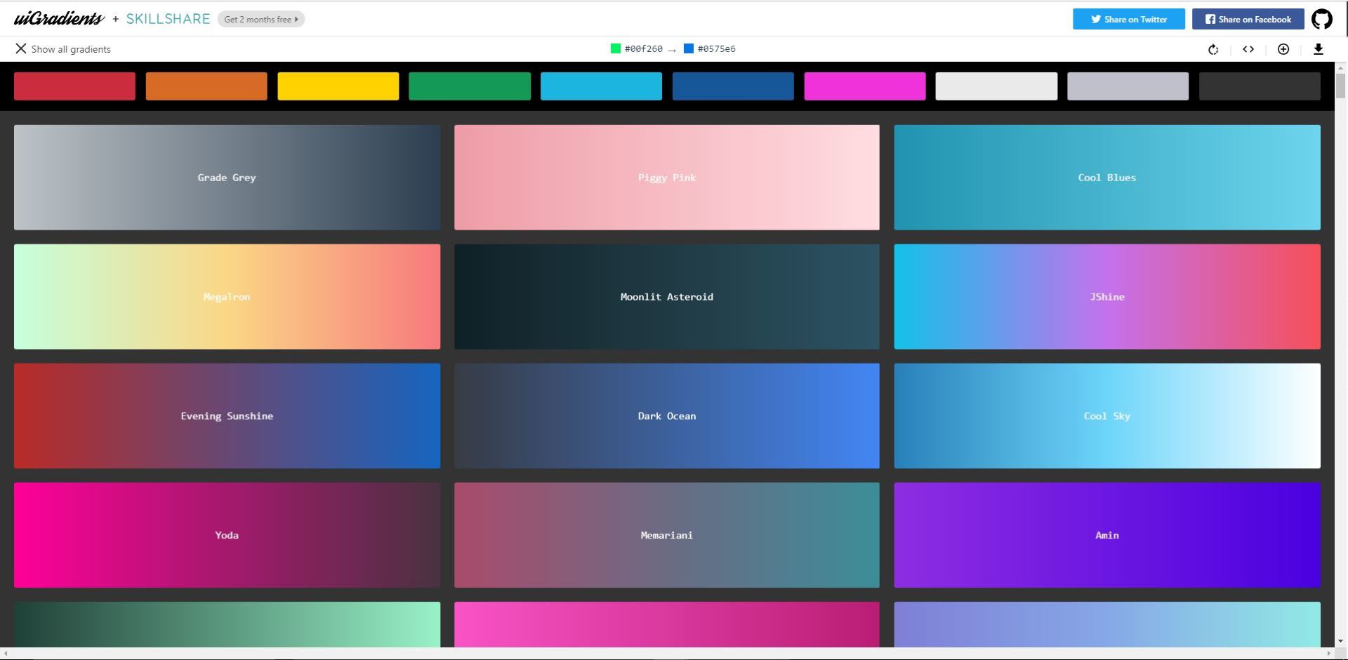
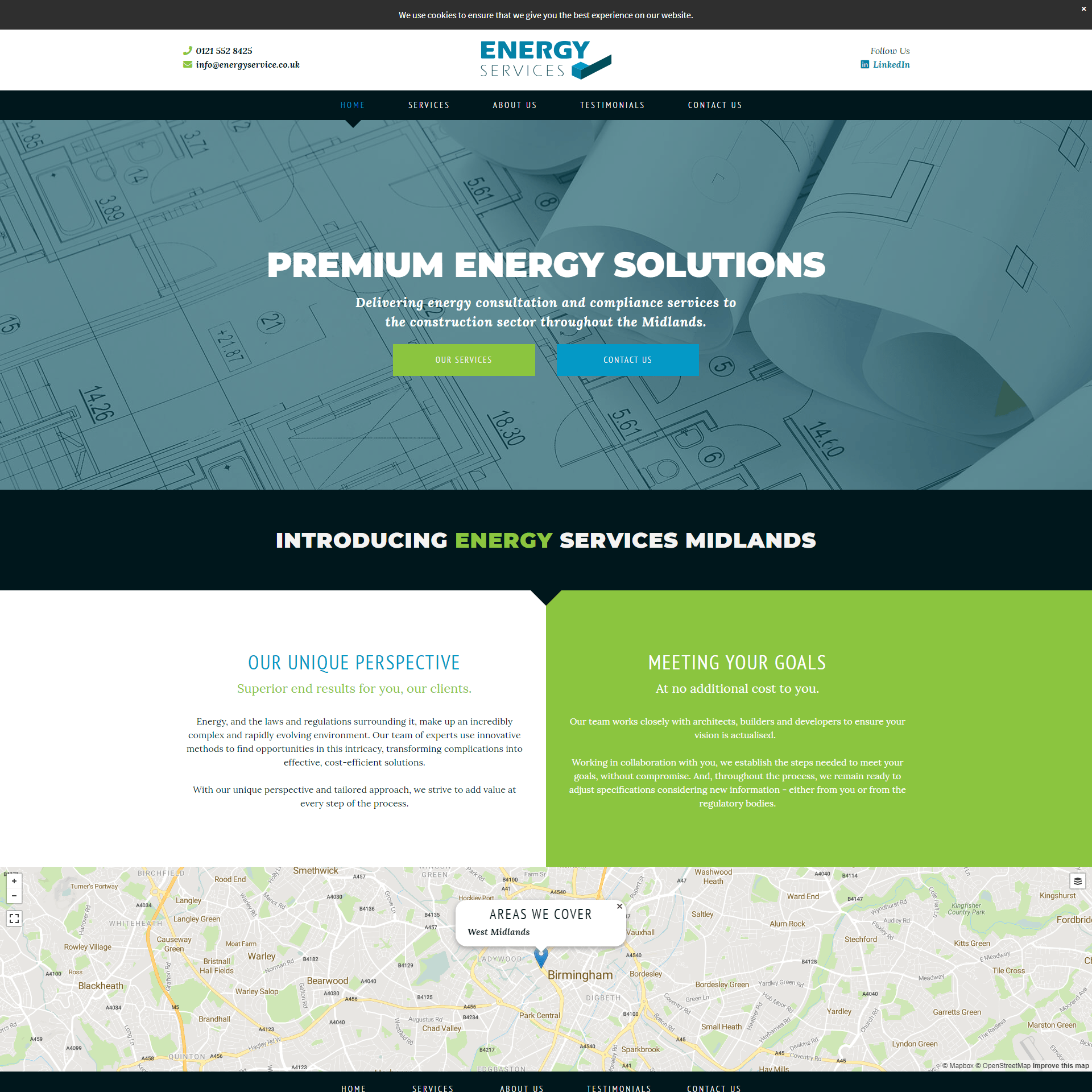
COLOR PALETTE

Gradient accents - Associalte color with key user goals

VOICE OF THE COPY
ICONOGRAPHY

Combine icons with product images

Associate icons with text
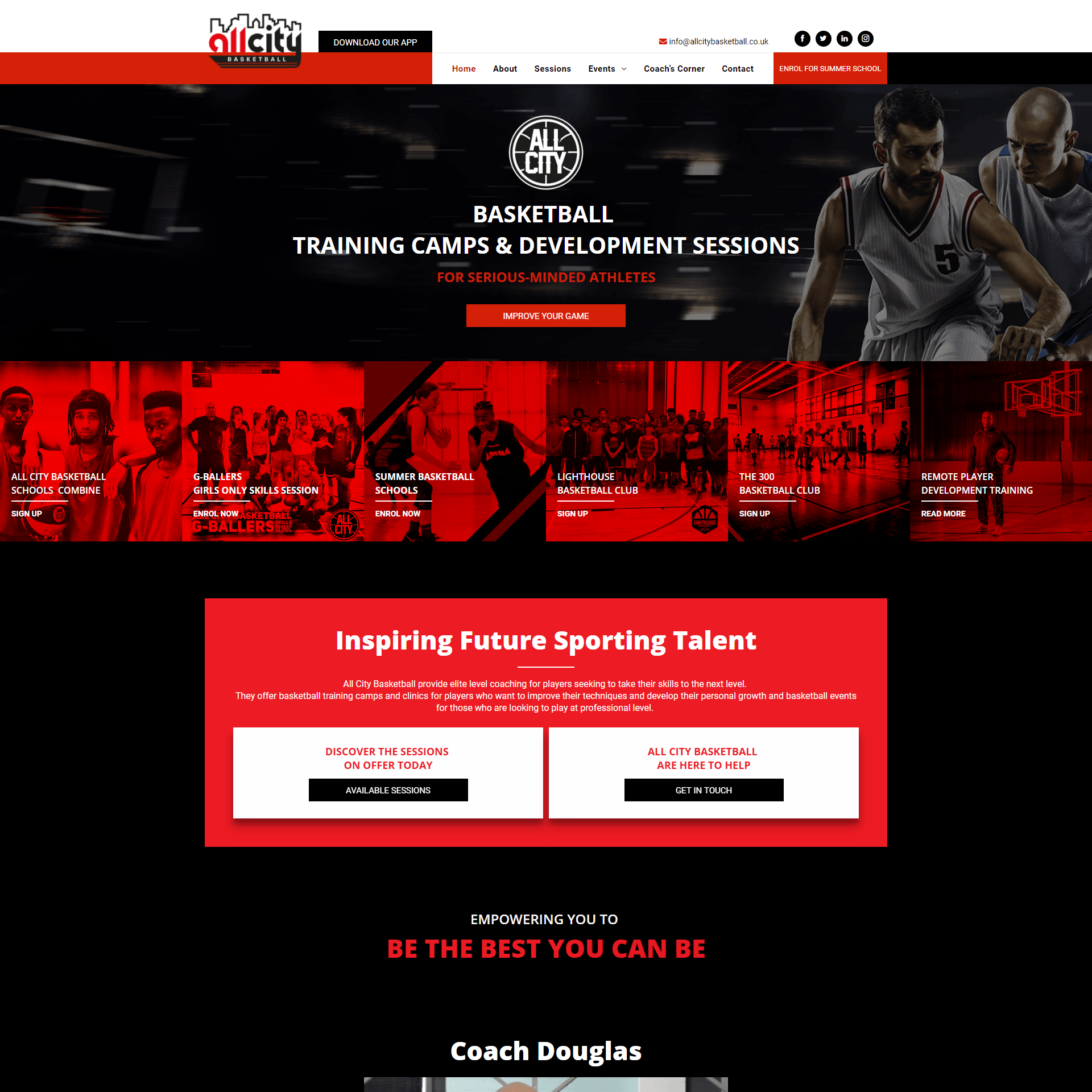
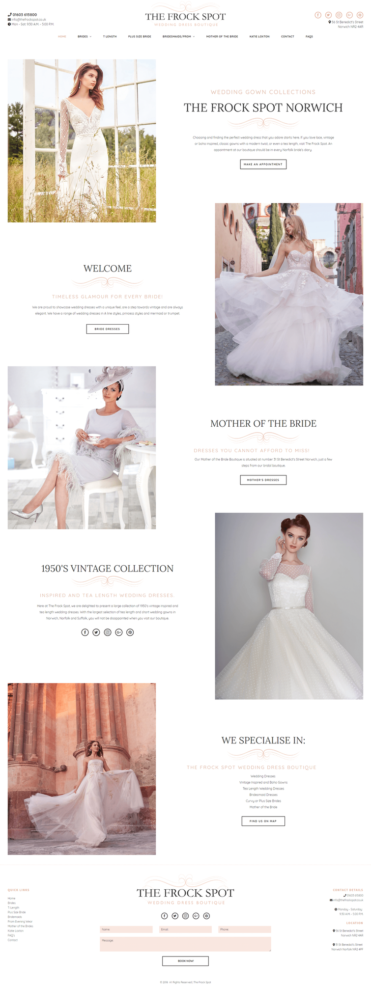
IMAGERY
- Only use relevant images. Users react to visuals faster than text, so make sure your content matches the supporting visuals. You should select images that have a strong relationship with your product goals and ensure that they are context-relevant.
- Images Shouldn’t Create A Visual Noise - Don’t put a lot of effort in creating purely decorative images because people usually ignore such images. Instead, choose images that showcase the purpose of your product.
- Use High-Quality Assets Without Distortion- Make sure your images are appropriately sized for displays across all platforms. Cloudinary which enables you to interactively generate responsive image breakpoints.
- Image-Focussed Design Isn’t For Every Page - Images that are used in user interfaces should support the product, but not obscure other important content or overshadow functionality.
- Use Multiple Mediums
- Both illustration and photography can be used within the same product. Photography is ideal to showcase specific entities and stories. Illustration is effective for representing concepts and metaphors, where photography might be alienating.
- Have A Point Of Focus - Avoid making the user hunt for the meaning in the image and ensure that a clear concept is conveyed to the user in a memorable way.
- Show Real People - Human images are a very effective way to get your users engaged. When we see faces of other humans, it makes us feel like we are actually connecting with them, and not just using a product. Try to avoid crowd shots; use photos that have a single main subject instead. Strive for images that represent genuine stories. Take photos of your people doing interesting things. If you have a product, consider ways they can interact with that product.
- Blend Images With Designs - When using images in your design, ask yourself if the images you’re taking will match the aesthetic of your website.


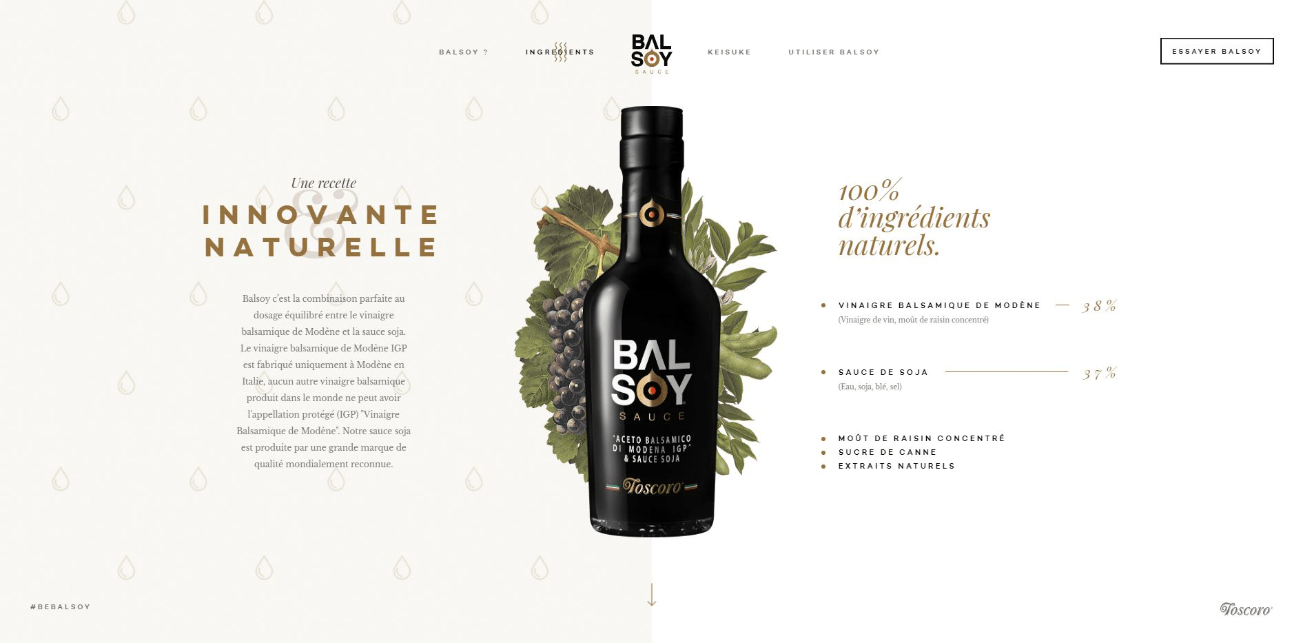


IMAGE Size & Format
- To be researched : https://developers.google.com/web/tools/lighthouse/audits/oversized-images
BUTTONS
- Make buttons look like buttons - No matter what shape you choose (squared or rounded corners), be sure to maintain consistency throughout your interface, so the user will be able to identify and recognize all UI elements as buttons.
- Label buttons with what they do for users - try to make these clear and distinct while taking into account the width of your buttons creating the labels.
- Put buttons where users can find them or expect them to be and make sure the contrast between the background and them makes their spotting easier.
- Make it easy for the user to interact with each button - take into account the width and height and padding between them.
- Make the most important button clearly identifiable - you can use primary and secondary buttons to establish a sort of hierarchy for your user actions.

SPACING
FORMS - TBC
- Usually placed above the field, labels tell users what information belongs in a given form field. This is the most common label placement and, as validated by Google’s UX research, for good reason. It adapts better to smartphone sizes, which is essential for responsive markup.
- Justify labels left
- get more attention and won’t blend in with other fields. In addition, the contact form will take up less space vertically. But keep in mind that such an approach works well only for desktop views; for mobile, size is an issue (the screen is too narrow for both a left-placed label and field). That could cause trouble for users, who might not be able to see input data in full.
- Interactive labels placed inside the field
- The advantages of this approach are obvious: It saves space, and the animation is understandable to the user. But animation in forms is not always the best solution. It depends on the form’s context. If you working on a form with very few fields (a login or newsletter box), then top-aligned labels are not so necessary because there isn’t much information the user needs to recall. It works better on complex forms with multiple sections. Interactive labels placeholders win by a mile over static ones. When the field is clicked, the label moves up, staying visible, while the static one just disappears. [TBC: can we use interactive fields in wordpress websites using contact form 7 or beaverbuilder's form]
- Disappearing placeholder text strains users’ short-term memory.
- Without labels, users cannot check their work before submitting a form.
- When error messages occur, people don’t know how to fix the problem.
- Placeholder text that disappears when the cursor is placed in a form field is irritating for users navigating with the keyboard.
- Fields with stuff in them are less noticeable.
- Users may mistake a placeholder for data that was automatically filled in.
- Occasionally users have to delete placeholder text manually.
- Mind the spacing
- The field and label should be visually grouped, to avoid confusing users and so that they can understand which label belongs to which field. Make sure to avoid loose padding, where labels are placed equal distance between two fields.
- Auto focus the first input field
[TBC: in WP this features comes with most forms - test and see. In duda test if possible ]
- Never use Caps
- especially in forms that include three to four fields. All-capitalized letters are hard to read. Also, they give the appearance of shouting.
- Name the button to explain what it does, rather than using a generic label (like "OK").
- Separate the Primary Actions from Secondary Ones
- Emphasize the buttons
- Don’t make the button active until all form fields are completed. This can be a great solution to help the user visually check their data before sending. [TBC: Test for a workaround in duda \ check for wordpress]
- Add Autofill
- Maked Inputs
- This is a plugin that automatically formats a field. Such a solution well suits dates, times, mobile numbers and more. This plugin makes filling a form much easier. [TBC: test in Wordpress]