
HEADER TEMPLATES
INTRO
In web page layout, header is the upper (top) part of the web page. It is definitely a strategic part of the page as the area which people see before scrolling the page in the first seconds of introduction to the website. Being somehow a sign of invitation, header should provide the core information about the digital product so that users could scan it in split seconds. In design perspective, header is also the area making the broad field for creative design solutions which should be catchy, concise and useful.
Headers can include a variety of meaningful layout elements, for example:
- basic elements of brand identity: logo, brand name lettering, slogan or company statement, corporate mascot, photo presenting the company or its leader, corporate colours etc.
- copy block setting the theme of the product or service presented
- links to basic categories of website content
- links to the most important social networks
- basic contact information (telephone number, e-mail etc.)
- switcher of the languages in case of multi-lingual interface
- search field
- subscription field
- links to interaction with the product such as trial version or downloading from the store
It doesn’t mean that all the mentioned elements should be included in one web page header: in this case, the risk is high that the header section would be overloaded with information. The more objects attract user’s attention, the harder it is to concentrate on the vital ones. On the basis of design tasks, designers, sometimes together with marketing specialists, decide on the strategically important options and pick them up from the list or add the others.
HeaDER 1
Simple Header
This type of header can be used for simple websites like One Pagers
(Landing Page Packages) or Lite Packages
when you don't have all the contact details you need in order to add them on the header or the customer doesn't desire to have all those information displayed on this section. This type of header shoulder spaced, clean and comprehensible.

HEADER 2
Complex Header - Bottom Navigation Bar
This type of header can be used for complex websites like Pro Packages
because on this type of projects you have more common information and contact details and the possibility to add information in the header area
and create a complex header design. This template can be used in cases where contact info needs space
- for example, in this case, you have the entire right column dedicated
to place all the information like multiple phone numbers or email addresses, addresses, business hours, CTAs
or anything else the customer needs. Also, this layout can be helpful when you have a big logo
or you have a lot of links displayed in navigation
because the navigation widget is placed on a separate row and the social icons occupies a small space you have all the space you need to incorporate as many pages as you want.

HEADER 3
Complex Header - Top Bar
This type of header can be used for complex websites included in Pro Packages
or even in Lite Packages
if the client provides all the information needed. This template is used to emphasise all the content placed in the top bar. Most of the time, the top bar will include contact details, social icons, opening hours, addresses, a short disclaimer or displaying a promotional offers.Underneath this top bar is another row with the exactly the same layout as the
Simple Header (Header 1)so we can see this layout as a more advanced Header 1.

HEADER 4
Complex Header - Big Logo
This type of layout can be used for websites included in packages like Lite Packages
or Pro Packages in cases where you have to deal with a
big logo. The bigger the logo the bigger the space besides it so instead of adding another row for the navigation links or contact information we can use this space, you can add here both navigation link and the contact details, even a CTA.

HEADER 5
Simple E-Commerce Header
This type of layout can be used for simple websites included in packages like E-Commerce Packages.
This layout is very similar
with the Simple Header (Header 1).
The only difference is that this template has a shopping cart
included next to the navigation links and the store search widget if the customer wants to search for a product instead of navigate trough store and categories to find it .This type of header
can be fixed
so that wherever the customer is on the website he can easily access the shopping bag.

Disclaimer! The store widgets (shopping cart and search box)
are just for example purpose, in order to properly work you have to add them from the widget tab after you create the store page.
HEADER 6
Complex E-Commerce Header
This type of layout can be used for complex websites included in packages like E-Commerce Packages. This template is more
focused on enhancing the main focus of an
E-Commerce website that is
to sell.
This layout has the categories
displayed on the top bar
in order to make the store partitions be more accessible
for the customer, has the social icons
displayed on the left on top of the logo to promote the products and the store on social media and finally but not least the store search widget
placed here if the customer wants to search for a product instead of navigate trough store and categories to find it .The shop cart
is also present in this template directly next the navigation links in order to make the experience of buying much easier and simple, helping the customer to check, whenever he wants, what is his list status.
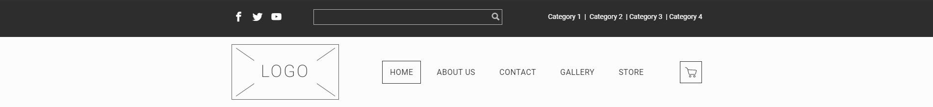
Disclaimer! The store widgets (shopping cart and search box)
are just for example purpose, in order to properly work you have to add them from the widget tab after you create the store page.