
QUICK AND RELIABLE LITE PACKAGE BUILD
Article by: Lateș Iulian
OVERVIEW
This article is a guideline on how to create quick and reliable lite package websites. As a quick disclaimer, you should know that this is not everything that you need to get the best timing when building lite packages, and there are also other skills that you need to master in order to make the best out of this article. If you are just starting out, I strongly suggest that you first read the different guidelines on this online experts guides website.
You have to know that to best design a website, a designer should have a library inside its head resembling different layouts, structures, and elements of a website. What I mean by this is that a good designer should have a few design possibilities lied out inside their brain after seeing the content of a page, they have to visualize a rough draft of how everything should look even before placing content on the website, and then to build upon that. To create this library inside your head, it is recommended that from time to time you should check inspirational websites. I have created a list of such websites and you can always find more of them on the internet at a qucik search.


Over time, will help you better understand design choices and will give you more ideas on how to better design a page. Observe and save sections (you can bookmark pages, you can save screenshots, or images, etc) that you like and use them in your designs, this will help you later on with your designs as you will have built a strong library inside your head and this means that at a point you will know how to structure everything from the beginning of the process and you will have a more enjoyable process of building a website.
It should also be mentioned that this article is mostly about the steps one should take to optimize their timing. It is recommended that you read and follow along with this article, if you get stuck on something, try to improve on that to have a smoother process.
Let's get going.
SETTING THINGS UP
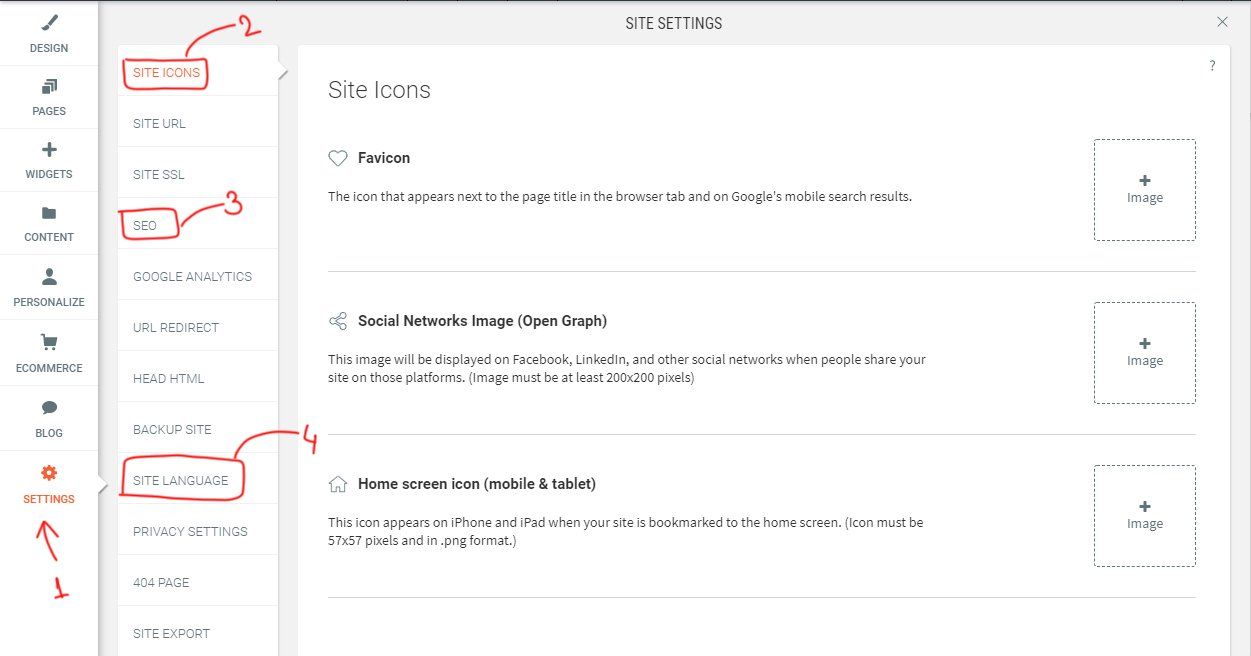
The first step of this process consists of going to your project issue and to download all the project files attached. You will then open the ones that you need, the copy template, the design brief, and the logo which you will import inside Adobe Photoshop. Right now, you will be looking through the basic things that the website must include, and after that, those details will be placed on the website. This step is not at all about the design of the website but rather about setting up the most fundamentals things that don't require design. By now you should have created a blank template website and go straight into the "SETTINGS" tab.
SETTINGS:
From top to bottom we should go through every setting and complete the details that we need. The first is the “SITE ICONS“ here we must place the favicon. We have previously opened the logo inside photoshop, it's time to create the favicon and place it on the website. You can create an image of 200x200px and try to include the most important part of the logo.
The next setting is “SEO“. We should now get inside the copy template and scroll to the end of the document and get the main site title, paste it inside the SEO settings, and then also get the description and paste it. After you are done with this please don’t close the copy template nor scroll back up as we will need this again in a bit.
What remains to do is to select the site language from the “SITE LANGUAGE” tab. This will get selected accordingly to the business location. And this is all for the settings tab.
PAGES:
Right now we should create all the pages that the client specified. Go to pages and delete every page except the homepage. Now open the copy template at the very bottom of the document where the titles and descriptions are, and what you should do is the following: First of all, enable the "NO INDEX" option so that the pages are not google indexable. This is a very much required step. After this start copying the titles and descriptions and the page names.
If you do now have a dual monitor setup you can do this by using the shortcut keys ALT+TAB, switch between the document and the webpage, copy the title, and paste it into the title field, copy the description, and copy it into the description field. When copying the description you should also look for the next page's name and after pasting the description create the new page with the name you have seen in the copy template, then repeat the above process until all pages are done.
NOTE:
Please take in mind that page names that have the "&" symbol in it will generate as broken links and you will have to manually change the links for this. For those pages click on the setting icon and then go to "PAGE URL" change the link with the name of the page and replace the symbol with the "and" word.
BUSINESS INFO:
The next step is to complete the contact details inside the CONTENT SETTINGS > BUSINESS INFO. Right here we have to enter the name of the business, the location, phone number, email address, social media, opening hours, etc. Every detail that the client completed inside the design brief that has to do with the ones above should be inserted here. You can find this information on the design brief's "SITE OVERVIEW" tab. This will make so that when you complete phone numbers, email addresses, open hours, and so on.. your information will get autocompleted when linked.
FONT AWESOME:
Everybody uses font-awesome, thus this is the next step. To place the link to font awesome you have to go inside the "DEV MODE" in the top right of your Duda bar. To see that button you need to see in the "Edit mode". Copy the link from your font-awesome account and paste it to Site HTML/CSS - head-section.html
You don't have a font-awesome kit link? Here is one for you: <script src="https://kit.fontawesome.com/75bcbaf329.js" crossorigin="anonymous"></script>
PLACING CONTENT:
The process of inserting data steps are over and fun part beggins, pasting all the content inside the copy template. Yes, before designing and finding the perfect layout for your website you should paste all the titles, paragraphs, buttons, etc. You should divide everything into sections. What does this mean? Well, there should be a hero section, an about us section, the services section, etc. Each one of these should be on a separate row, and every section should have some distinctive features. You want your homepage to be a bit diverse so that you can have what to work with later on. You should create sections that can be reusable on other pages and this is how you create consistency.
Get inside the copy template first page and start to copy-pasting the sections as suggested above. Right now the only thing you should worry about is creating distinctive sections. For example, we know that the hero usually has an image on the background, a title, a paragraph, and a button so we should build a row with one column and the things mentioned above. The about section for example usually has an image in it so you should have a row with two columns one should be empty because you will place an image later on and the other should have a title, a paragraph, and a button. The services section usually has more columns with icons and so on. You should only think about this design-wise but not more. We do this to have a better image of how the content will look on a page. You can get a better idea of what to build if you already have a visual of how things fit together.
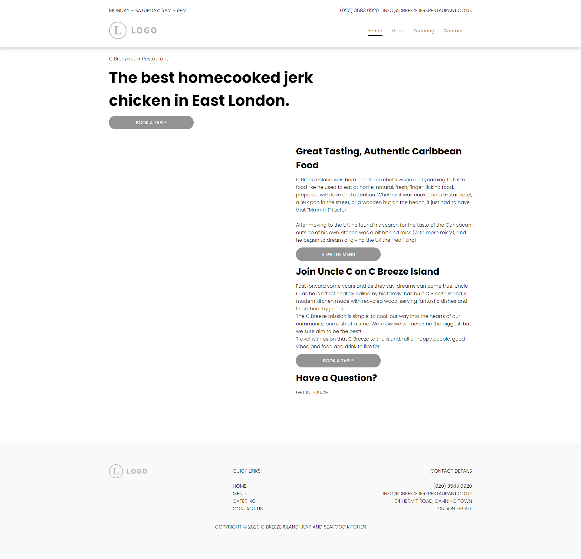
Here is how your website should look like after this step. This one is not very diverse but you will sometimes find websites that are not very complex and you will have to create elements on the other pages similar to what you have on the homepage. Here the most relevant element is the text along a long vertical image that will be placed on the left column. This element can be repeated through the website.
If you really want, in this step, you can place elements that were already created by our team. There are lots of premade sections, even for the
header
and the
footer.
DESIGNING
Now you have a rough draft on how your website’s content will fit on your homepage and it is now time to design it. As a quick reminder, you can find a lot of information on this guidelines website about how to correctly design and structure your pages thus this won't get too technical. Also if you ever run out of inspiration, don't forget to check the websites listed above.
SHORT INTRODUCTION:
You should incorporate as much as possible from what the client has given you. Pay close attention to the design brief. At this point, it is very important to create a strong feeling of what the client wants. Integrate as much as possible from the website they sent and liked (check design brief's "LOOK AND FEEL" and "PAGE STRUCTURE" tabs)but avoid taking elements from the website were disliked. Does the client want the website full width or does it want it boxed? What colors does the logo have and how can you integrate them? Can we create a palette that also has nice complementary colors? There are many questions you should ask yourself when you first structure the overall layout and if you really want to get technical about this, check the Style Guides on this website.
One advice is to not spend too much time on a single section of your website because you might find out that that section does not go well with the other sections, keep working on a section until you see that your ideas run out then move to the next one and go back to the previous section when you have some new idea. Working on different sections will give more ideas than just working on a single section until it is completely and because of this, the following steps should be worked on in which order you want.
ROWS AND COLUMNS:
It's always important to not change the left and right padding of the rows but in case you do, make sure you do it from the global settings and don't make it 0px, why? Because even if on the desktop version you can't see any changes you can certainly see some changes on the tablet version of your website, and if the padding is set to 0, your elements will stick to the margins of the tablet ( that can be done only if it is really intentional) also, the 40px left-right padding it's optimal.
It's recommended that your website breathes, meaning that there should be a lot of negative space around your elements as they help your website have a cleaner and fresher look. You can easily obtain this by giving your rows top and bottom padding, 80px is a fair amount but you can always experiment with this one. If you don't know how this exactly works, there are many tutorials regarding negative space on websites. You can click HERE to see an in depth video on this subject.
TYPOGRAPHY:
We should all agree that typography is one of the key features of a website. Imagine a website that is all modern, with clean and sharp images but with comic sans font, that is awful, right? If the client strictly asks for a font, you should use it but if not, it is a good practice to match the fonts to the client's business. If you don't know how you can get some inspiration from websites that are in the same work field. You will see that each business has a specific type of font. Some may have serif fonts, other sans serifs so chose your font wisely.
We have previously copied all the headings, paragraphs, buttons, and so on, and now we have to test out our fonts on the already placed out content on the website. Play with the size of the font, with the line height, letter spacing, colors, and so on. Try to make your homepage look beautiful with just typography and also try to use the global settings. I recommend watching the following VIDEO to find out some more information on this subject.
BUTTONS:
If you haven't changed anything about the buttons they are probably looking all gray and sad. Give them color and shape, but don't forget that this should be done from the global settings. There are some cases where you will need buttons that are different from the global ones for example let's say your buttons are red and you have a red background. In that case, you can create a style for that button but then that button should be copied and pasted when needed. You should not have at maximum 3 different types of buttons and they should be used consistently on your pages. You can always apply some effects on your buttons if you really want to and HERE is something useful for you that will make your buttons pop a little bit more.
IMAGES:
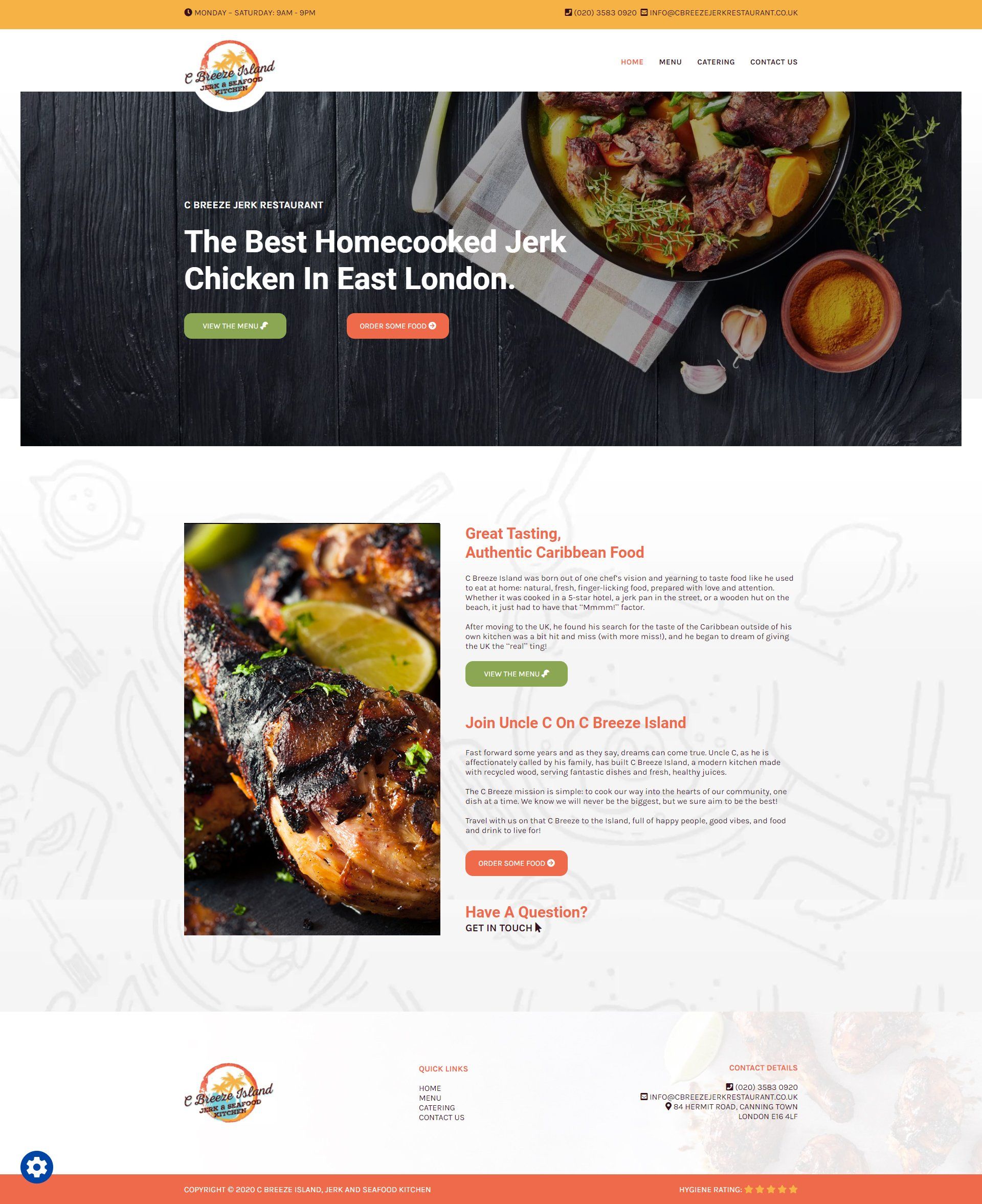
You should have a clean looking website already but something is missing. Images. Check if the client sent some images. If they did, search images in a similar style to those. Remember this is a lite package you should not overcomplicate things. Left or Right image with text next to it will do the job.
NAVIGATION AND HERO:
These two elements are the first thing that the user sees when entering the website. The user should be able to understand what the website is about at a first glance. Some key features that help the user better understand what the website is about are the following: images, titles, videos, symbols. Images should express what the business does. HERE is a video on how to create good looking hero areas.
FOOTER:
It's best to think of the footer as the place to go where you don't know what to do on a website. Have you ever been on a website and you were looking for certain specific stuff like maybe a link to a return policy, a contact number, some terms and agreements, a link for frequently asked questions, etc. The footer should contain all the details about the website. Anything that could be useful to a user should be placed there. Try to align the elements both horizontally and vertically. Try to imagine that the overall elements are forming a box.
DESIGN ELEMENTS:
By this time your website should look almost complete. As the last thing, you should try to fill your page with some good looking elements. Maybe add some lines under your headings, some background patterns, or some corner images on some rows. At this step you should try to improve your website as much as possible. Take it to the next level. Ask your colleagues what they think about it, how it should be improved. Pay attention to details.
Remember the image above with the website that contained only text arranged on columns? After the above steps that got transformed into this. It has negative space, colors that draws the user attention, the typography is layed out in a clean way, the images are resembling the business. The lite packages should be simple, not overcomplicated with groundbreaking design elements. You can build that for the PRO or ENTERPRISE packages.
SUBMITTING FOR REVIEW
After building the design of the website you are not over yet. The default process of a website is to build the homepage then the rest of the pages + the tablet and mobile. You will find out that there is a better and faster way to do things. Instead of sending your homepage directly for the review go one step further and create the tablet and mobile view for the homepage then submit your website for review. Creating the responsiveness in this step will allow you to build the rest of the pages with what you already have. You can now either save your entire page as a template and then place the whole saved section on the other pages and just modify what is needed or you can copy each row and paste it onto the next page, the choice is yours. This does not mean that you will be all done. At the end of the whole website, you will still have to change and tweak some minor things as through the process you have read about above you will still need to change some parts of your design.
Before sending your page for review please double check everything. Make sure everything is horizontally and vertically aligned also everything should be consistent. Check the buttons, the colors, the padding, etc.
FINISHING UP
You have submitted your website for review and now it came back, if you have to apply any changes you are going to start with that if not, as explained above, start copying the already created sections from the homepage ( that are already responsive ) to the rest of the pages and modify the sections according to the content inside the copy template and design brief. If you have correctly applied the above steps now the rest of the pages should easily be created, your design is already done and your job now should only be to copy the existing designs onto the other pages, switch columns left and right, maybe tweak something small to them but overall, most of your job was done on the homepage.
Before sending your website to QA remember to double-check everything, go through the checkbox list on Jira, read every list item then check if everything is as it should. There might be things that you have missed out, and also there might be times when you applied something but Duda hasn't applied the changes. This is why is better to double-check as you do not only make things easier for yourself but you will also help your colleagues when checking your website.